Streamlining ticket purchases for long range train travel
PKP is biggest rail provided in Poland, however their current app design makes booking travel confusing and tedious. In this project I redesigned ticket flow, simplifying the process and adding core features enabling passengers to book their travel effortlessly.
UX Design
Personal Project
2025

Context
Challenge
PKP app (and train booking app in general) is very complex, featuring many design elements that are tailored specifically to the use context of given provider. In this project I focused on ticket flow and optimising purchasing process, while also making sure my solutions will be tailored to the use & business requirements of the company. On top of that it was very crucial for project success to thoroughly research user behaviour and patterns regarding traveling with trains in Poland.
Optimise and Improve ticket flow
Update app’s UI
So, who do I design for?
Research
Millennials & Gen-Z
This group are the most active users of PKP app and compose majority of people traveling by trains in Poland. They are tech-savvy and value convenience above all.
Business Travellers
In recent years, Polish economy witnessed significant growth, which resulted in many people now travel between important enterprise hubs across country(ofter with PKP)
Tourists
International & local tourists rely heavy on PKP services as main mean of travel between larger cities and tourist destinations in the country, which emphasises need for accessible product.
Expert* Review
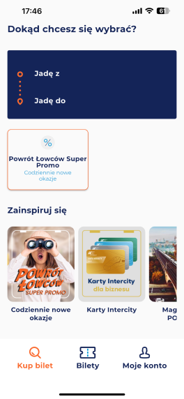
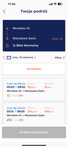
To better understand potential problems with the UI and structure of the current app, I conducted an expert review, to uncover potential problems and map out areas of the app that need most attention.
Research

Main takeaways
Cluttered UI
UI of the important sections of the app is cluttered, not following any guidelines, often having inconsistent spacing. All of this hinders scalability and readability.
Inconsistent Labels
Many Labels thorough the app are inconsistent, changing names depending on the page(even though it’s still the same features)
User Needs & Expectations
Research
During research, many users emphasised that having efficient way to input data is one of the most important features they would expect, since it saves time.
Information about delays & disruptions
With long range travel and many connections, having real time update is very important for passengers, enabling them to plan ahead and stay informed.
Clear information structure to enhance security
When it comes to searching for actual connection, many users mentioned that they expect interface to display information in structured and clear way.
User personas & Planing behaviour
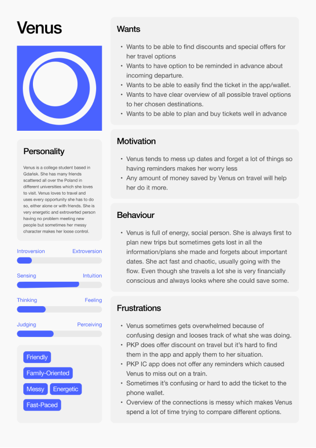
To get better understanding of core passenger profiles, I created few user personas based on research I did at the beginning of the project. This lead me to come across interesting pattern that helped me to highlight 2 prominent type of personas relating to how people plan their journeys.
Research
Structured Planner

Messy Planner
Why does it matter?
Different approach
It’s important to consider how different people plan their travel. Some of them need to know every detail because travel is part of their living or they use it to get to work, which means no mistakes allowed. On the other side, a lot of people(especially daily commuters & tourist) usually are happy with whatever comes first.
It takes time
Different planning behaviour also reflect in time it takes people to buy their ticket. More structured approach usually involves much more information comparison, while users who plan on the go, want to be time efficient and get going fast.
Research
Insights from user research
Through the research, I managed to get a lot of insight into how users operate within the app and what are the core needs & features they expect. Here are some of most interesting ones.
Ticket Selection
Research have showed that most of the people prefer to indicate ticket type or add passengers earlier in the process, before they start searching for connection.
Discounts
E-wallet
Even though you can access the ticket inside of the app, users usually prefer to have ability to add ticket to their phone wallet(better offline usability)
Quote from interview
“I like to have the ability to choose how many people are traveling up front, It saves time and shows you better price predictions, however I do appreciate if I can edit my choices later”
Understanding the journey
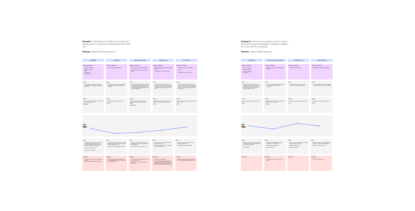
To finalise my research and better understand on which areas of current product I should focus the most, I decided to use customer journey mapping in order to pin point potentially chokepoints in current flow and better identify problems with the design.
Research
So, what's wrong?
After finalising research, I combined all of the information together and listed key problems that impact the product and it’s ability.
Problem
Confusing Flow
Users agreed that current flow can be confusing at times, especially closer to the earlier part of it, where limited search bar and weir way of accessing date & time selector can catch some people off guard.
Information overload
With recent updates to the app, UI became very cluttered, especially when in comes to cards and journey information, often displaying a lot of unnecessary information that hinders readability.
Unclear Discounts
Even though discounts are located on main page, it’s hard to notice them. Also further into the flow, labelling of the discounts is very unclear, not giving users any hints about it potential application.
Before I jump to Figma...

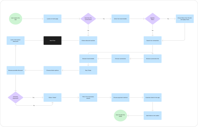
Prioritisation matrix & New ticket flow
Before design, I wanted to make sure I will prioritise most important features and that I have new clear flow to implement, that builds upon the research and simplifies the process of buying tickets.
Solution
Design

Visible Discounts
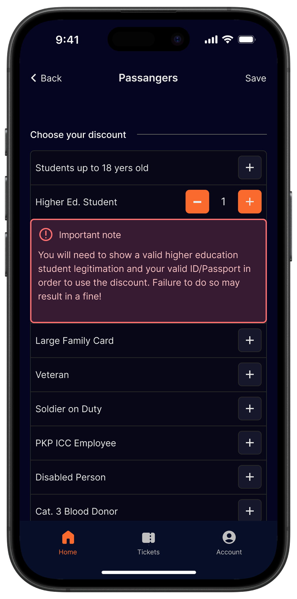
Now discount section, shows more visible cards, that consist of labels that actually tell user what potential discount they can get.

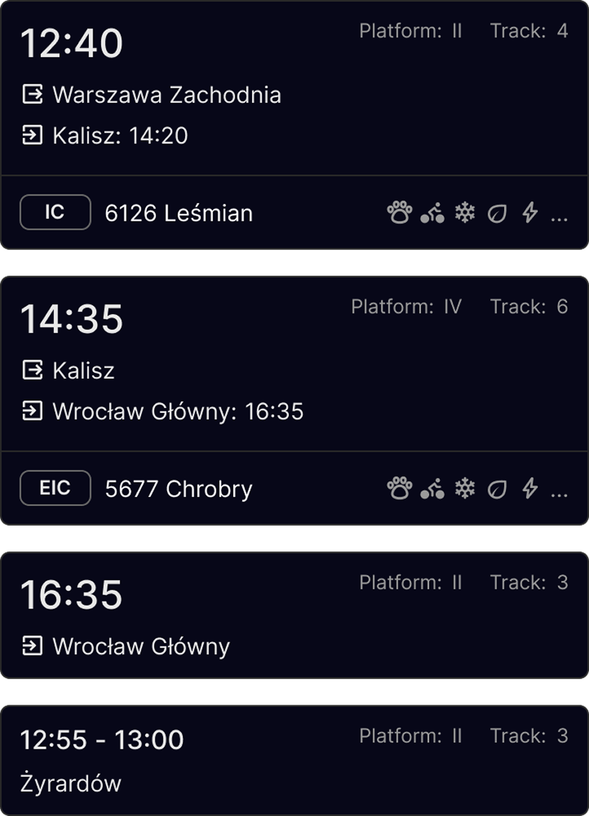
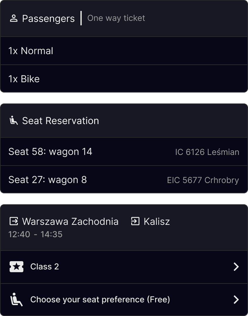
New Cards
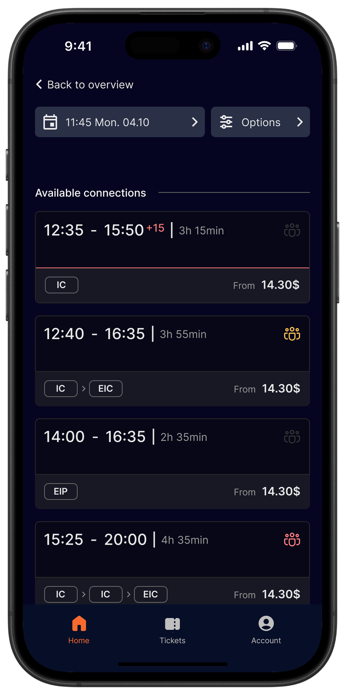
New UI includes new set of cards, containing important information like travel destination, times and layovers. All cards are constructed in a way to provide users with information they need at the time, without overwhelming them.
Scan-ability
When designing, I put high priority on making the cards easy to scan. Big labels, clear typography and spacings as well as information structure makes their UI clean and responsive.
Prevent Errors
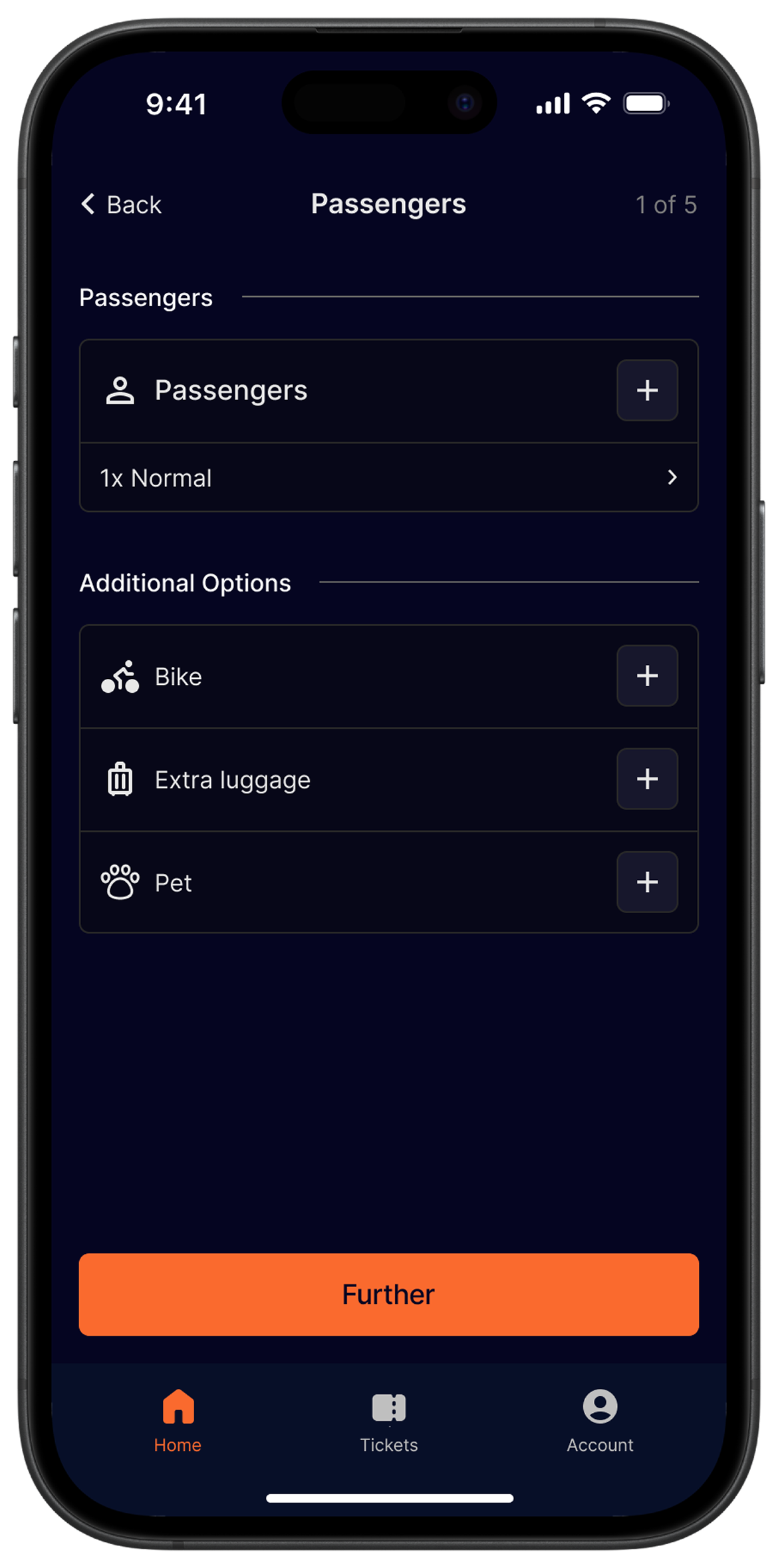
Error prevention is very important part of good product design especially when user’s money is at play. By introducing smart pop-ups and reminders, I made sure that user stays informed about his actions.
Make it flexible
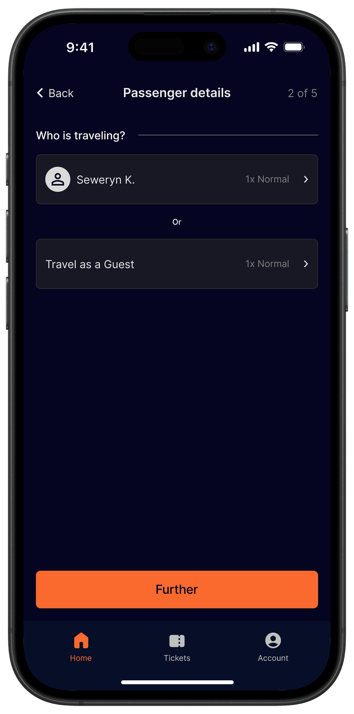
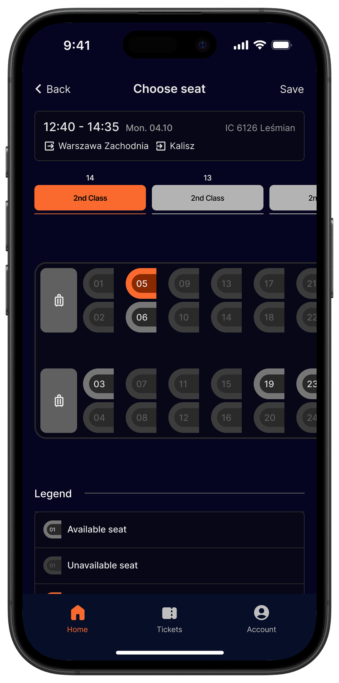
It’s very possible that in a rush users might forget something or add a wrong option. In my design I introduced many options to quickly change or adjust discounts, passengers & ect.


Information structure
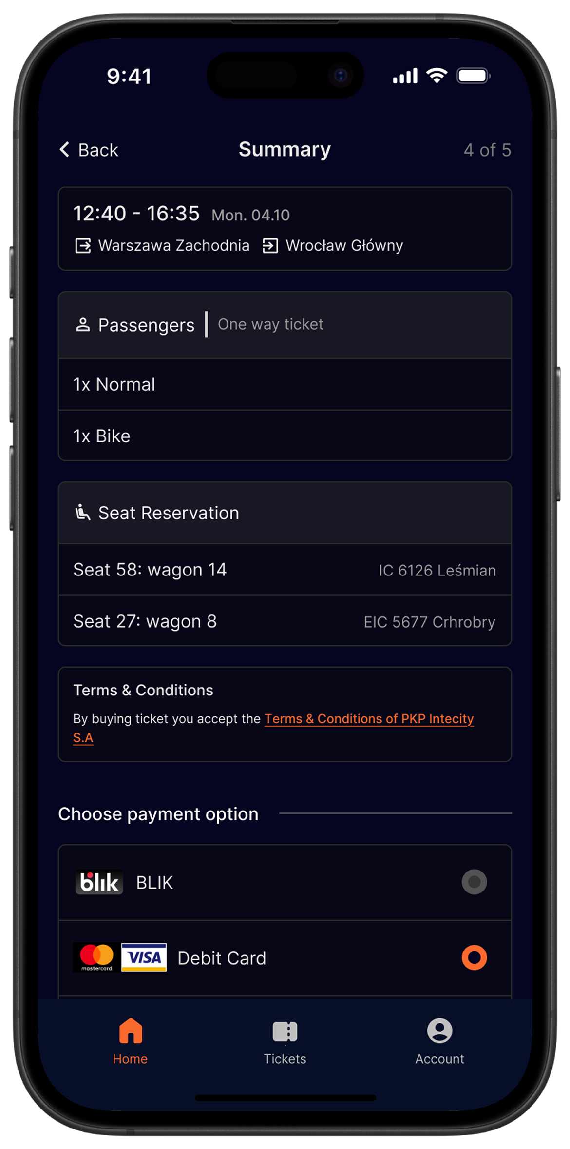
New design utilises progressive disclosure to limit amount of information visible at once, to reduce overwhelming users. First part of the flow have only most relevant information at hand & later more detailed overview appears to reinforce decisions.
Provide Feedback
Since there is a lot of variables when it comes to choosing a ticket or selecting connections, I put high emphasis on providing users with steady feedback about how far in the process are they and what are their current choices / status.
Testing
Research
Usability Protocols
To validate the design I decided to perform usability testing. By checking many scenarios, including the most probable use cases for this app, I tested time needed to complete tasks, success rates as well as heuristic analysis.
A-B Testing
Considering how complex this design is, some way to check for best solutions for many of UI elements were needed. A-B testing helped me to choose which elements needed change or replacement & which worked good from the start.
Iterations
Research
Important note!
*Design you see in “Solution” part is the final version, after testing and iterations. Below you will be able to see some elements that were part of iterations based on feedback.
Examples


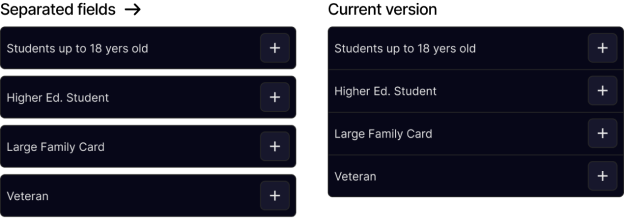
Those are just some examples of iteration within the design based on testing. Main focus of the iterations revolved around improving scalability, decluttering UI and making some important details more visible or accessible to the users.
Impact
Design
-30%
Less time needed to buy a ticket compared to previous design.
User 1
“New search bar feels so much better. I really like the fact that I can now choose amount & type of passengers right away. It was one feature that I felt like was missing in the original app”
User 2
“I really appreciate the fact that the new design reassures me along the way & that I can edit my information or tickets from multiple points in the design, I think this is very important..”
Overall impact
After testing the design I can confidently say that I reached my goal of improving the ticket flow of the PKP app. New design significantly reduced time needed to complete the task while also expanding flow, adding new ways user can interact with it. This design is much more flexible and easy to use compared to it’s predecessor, with information clarity being one of biggest improvements.
What’s Next?
Future
More Flows
This project was focused mainly on improving ticket flow, however during research I came up across other interesting insights that could turn helpful to future explore the product and add more features to it.
More Testing
After initial testing with users I’m confident that I achieved my goal, however I still have few smaller features and UI that I want to test before I’ll jump to next projects.
High Contrast mode
Even though all the content inside of the app passes accessibility checks, some cards and dark mode may still be too hard to read for some people, that’s why I want to also develop some example pages for very high contrast mode, made especially for people with vision impairments.