Redesign of the review on StudyPortals website
StudyPortals is one of the biggest & most well known companies, specialising in helping international students choose their next study. For this project I was tasked with redesign and improvement of their previous review section on the website.
UX Design
Client Project
2024
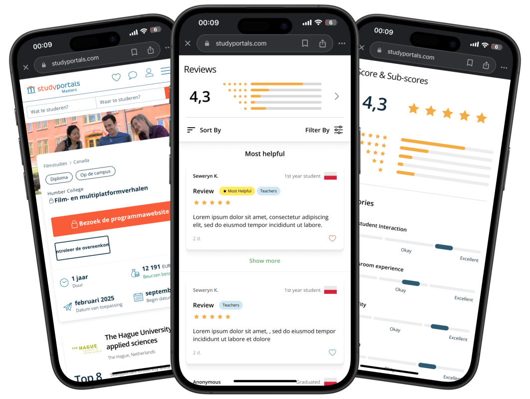
Context
In 2024 my school was partnering with StudyPortals as one of potentially clients students can contact and work on assignment for (fully independently). I managed to get in contact and got briefed in on the design challenge and what exactly is requested from me in order to deliver final product. This project consisted of of extensive user research, with in depth documentation of the process as well as design / prototyping part where I could use my insights in order to develop meaningful solution.
Problem
StudyPortals receive a lot of student reviews throughout their websites and apps but the current way of presenting and collecting reviews is not that clear and engaging for the users. It also can be more helpful in terms of reviews and content presented. Additionally current reviews have some categorisation and relevancy issues.
Design Challenge
“The challenge is to improve the quality of the reviews collected & present the reviews in a way that prospective students can use them to make an informed decision when choosing a programme and a university.”
But who are the users of StudyPortals?
Research
Students (new & current)
Students compose majority of the user base, with most important group for this project being users looking for new masters degree. On top of that it’s also important currently enrolled students.
Teachers
A lot of university students are keen on looking at students reviews and leaving one themselves, so considering their needs will also be important to ensure viability.
University Staff
Universities and their staff often use StudyPortals reviews to get feedback on their courses and campus life and potentially use this to identify opportunities to improve their programs.
Desk research
Before conducting any type of user research, I wanted to get better understanding of what exactly makes good review & what is already used by competitors / other big players. Takeaways from this turned very helpful in preparing set up for further research later.
Research
Interesting directions
Negative Reviews
Highlighting helpful negative reviews can help build user trust. Many tests have shown that people usually start scanning from negative ones first.
Number of reviews
Providing decimal number of reviews can help users make decisions regarding product / service, as usually people trust more in products that have more reviews.
Product Attributes
Research Methods
To conduct my research I decided to pick 2 methods that would enable me to collect vast amount of data, while being time efficient, since deadline for the project was tight.
Research
Surveys


Surveys were good way of obtaining a lot of data from many different backgrounds of users. That also helped me defined some patterns and most prominent problems and pain points users were addressing. This way I also managed to obtain potentially list of categories users are interested in while looking at reviews.
Interviews
To add more in depth data to my research I decided to interview few students(also upcoming) & university staff to get more insight into their thought process while using reviews and discuss some important details regarding way the reviews are usually structured. (Through data triangulation I managed to also use some data from surveys to validate and expand it).
User personas
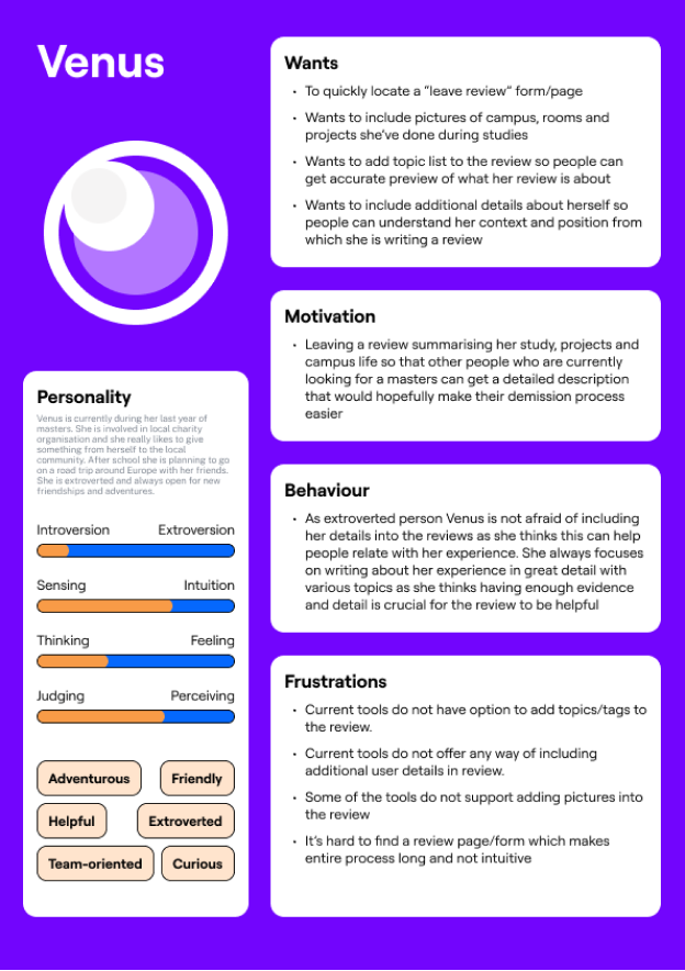
Based on my research and patterns identified through it, I prepared personas that would reflect needs and motivations of main stakeholders, to help me better understand their point of view before brainstorming potential solutions.
Research
Researcher

Reviewer
Important takeaways
Efficiency
Reviews should be an efficient way for people to find relevant information. High priority should be put on creating features that enable users to scan through a lot of data effortlessly and fast. Details come later, first users need to be able to get a general idea about what they are looking at.
Categorisation
Introducing some kind of categorisation could prove very impactful for both people looking through reviews & reviewers themselves. Clear categorisation can be helpful to improve scan-ability as well as enable users to filter through them. Also reviewers would be able to indicate better what their review is relating to.
Research
Insights from user research
During my research I managed to talk to and see answers from a large numbers of people, including students and school staff. Thanks to that I was able to find out some interesting insights.
“Most Helpful”
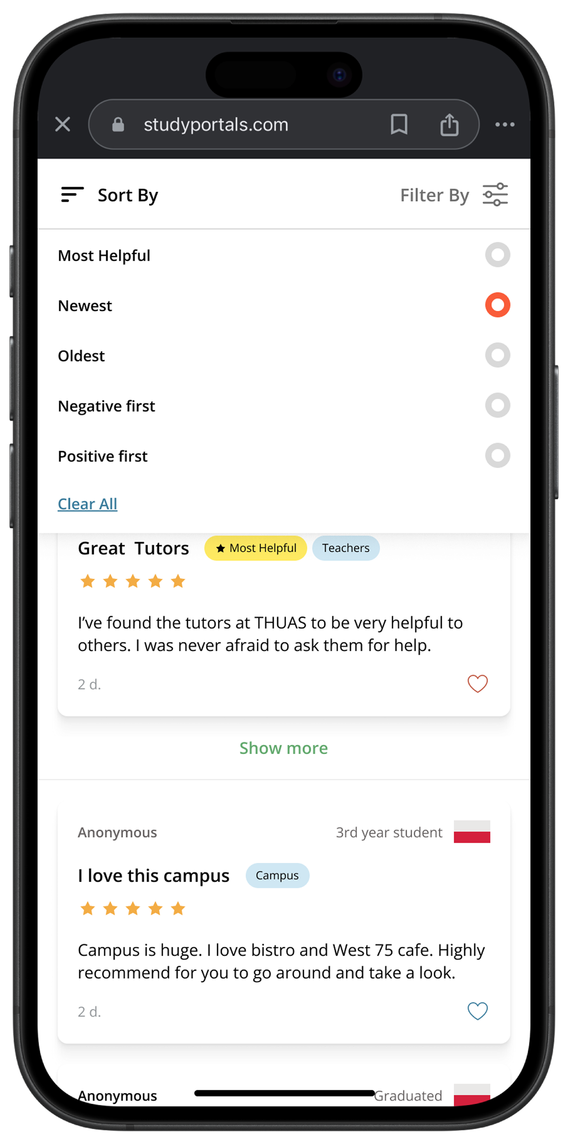
Most of the users prefer to view “most helpful” reviews first, as they usually have most up votes and are trustworthy / relevant. Adding quick way to view them is important.
Anonymous
Most people say that big factor stopping them from leaving a review is the fact that they are not being anonymous. Some of them fear that school or classmates might find out.
Quote from interview
“Actually I think I’d leave some review on our current programme if I would know I’m 100% anonymous. Especially because the review probably would be negative... ”
Possible opportunities
After finalising research, I combined all of the information together and listed most prominent opportunities for the design.
Problem
Tags & Intuitive filtering
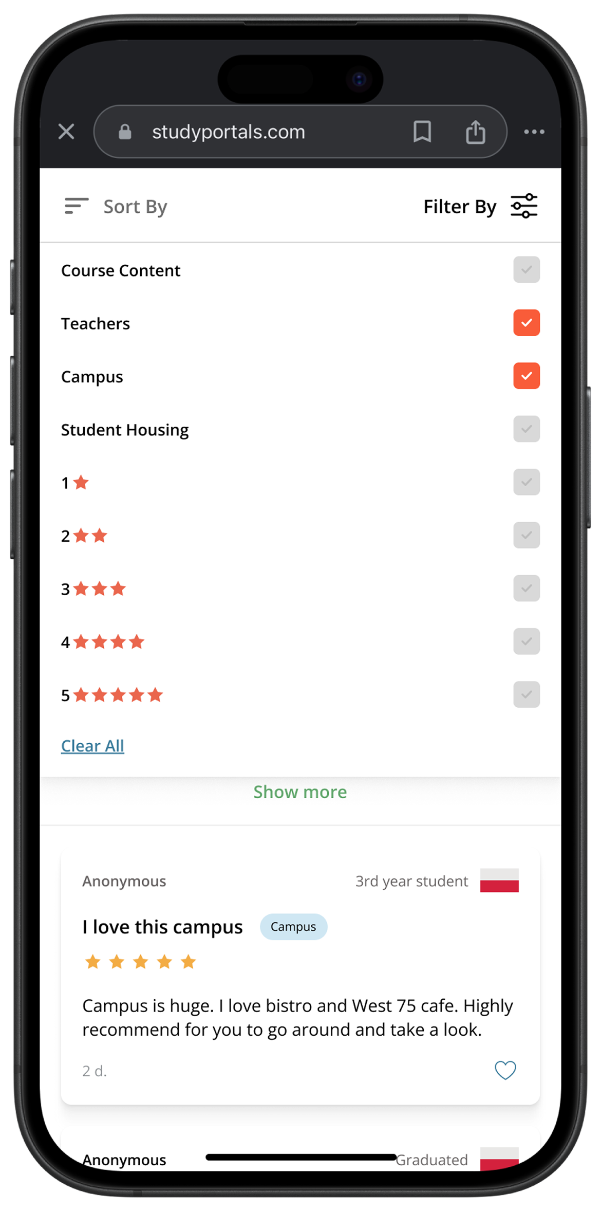
To enhance filtering and optimise scanning efficiency & speed, there could be tags created that would be visible on review cards, clearly relating to chosen category. Also while leaving the review users would be able to add tags to their review to indicate it’s content.
There could be max. number of tags that can be placed on review. All of the tags would be pre made so users can choose. This would ensure easier back-end implementation for algorithm purposes.
Replies
On top of just leaving separate review, there could be a “reply” function implemented, enabling users to engage with others reviews and make it very simple and fast to express their thoughts. It would also help make the review even more credible.
Sub-Scores
User Details
Enabling users to set their details can improve trustworthiness of their reviews and set some important context for reviewers. Also enabling them to comment anonymously can increase number of reviews that will be filled in.
Leave review CTA
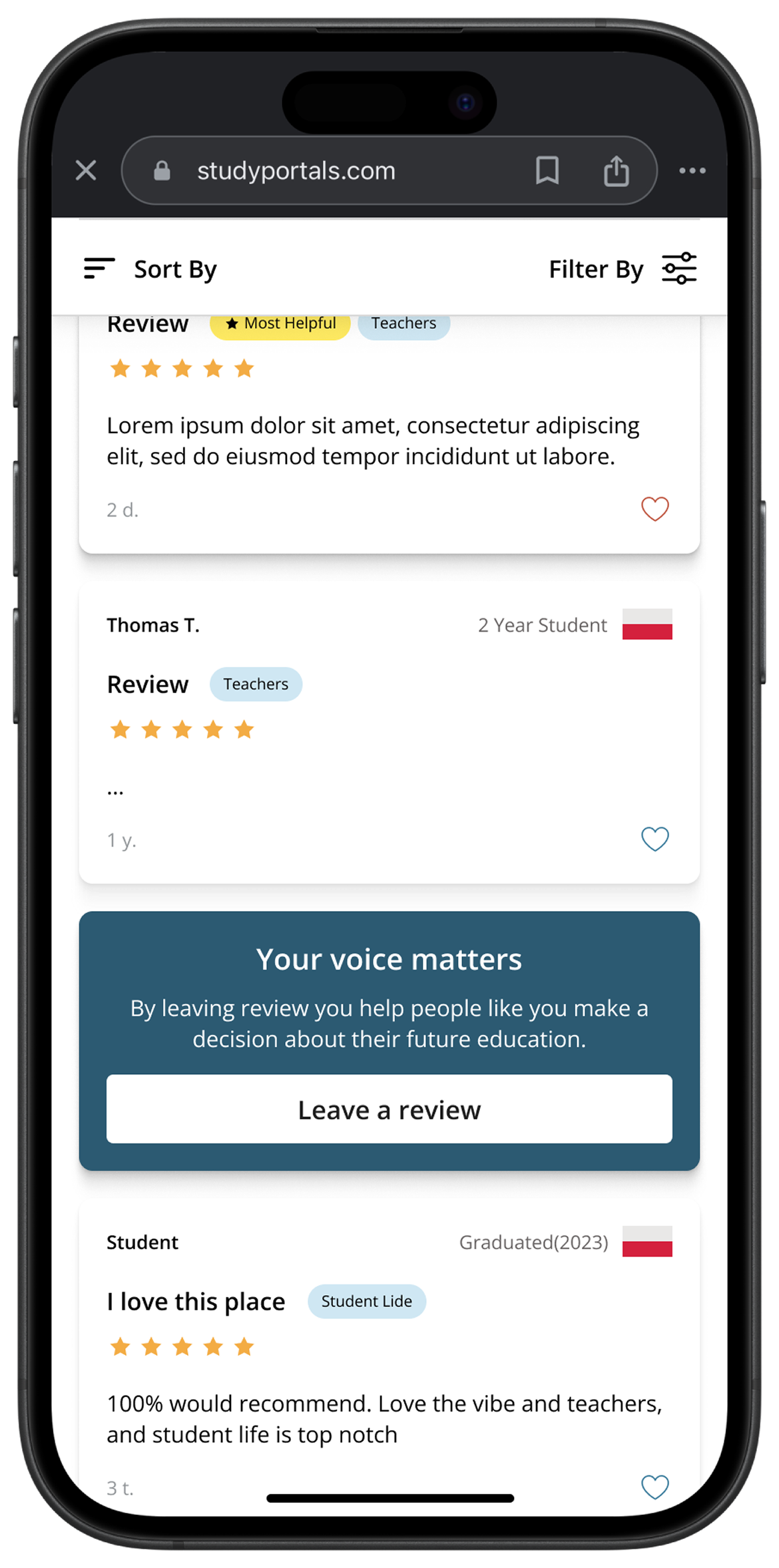
On top of usual review flow, there could be non invasive CTA or card section added that would prompt / remind users that they can leave reviews. Also it would be possibly easy way to move to review flow.
Solution
Design
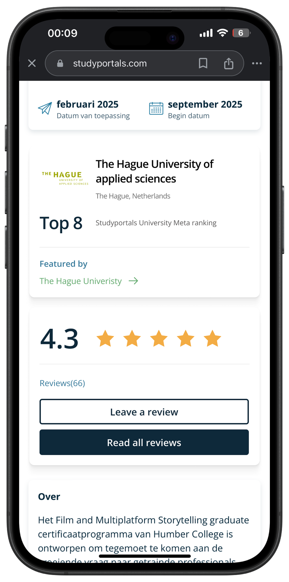
Easy Way to leave review
Now, there is additional card added on main page of the website which leads directly to review section, featuring 2 buttons. 1 clear CTA that leads to reviews, and one secondary but still legible button that opens the “leave a review” form.


Sub Scores
In the review from, users are asked to rank particular features of the school / programme (there is option to opt out of it). Weighted scores are then displayed in sub scores page, giving users quick glance at key points of the product.


Flexibility
Now, each review is much more flexible in a way it can be interacted with, giving users more freedom. Users can now choose tags & categories and input personal details to the review, such as name, country and current student status.
Replies
New cards enable users to see replies and comments of other users and leave replies themselves. All of this helps user engagement & enables them to share pieces of information faster, without the need to use long review form.
Reminders
On top of CTA on the main page of school info, inside of review section there is subtle reminder card that poses as entry to the review form. This ways users can be reminded about importance of leaving review, without it being obstructive.
Testing
Research
A-B Testing
Before finalising the design, I conducted multiple A-B tests to check with users which design version are most understandable and fit the challenge the most. Based on the choices final solution was updated to the state you see above.
Usability Protocols
When prototype was ready, I prepared multiple scenarios & protocols for the users to perform and leave their feedback. Main focus was to see if the flow is understandable for the users & if they can perform all the tasks in time.
Examples from AB testing


Impact
Design
96%
Task(s) completion success rate based on protocols from usability testing.
Student 1
Student 2
“I think what caught my attention the most are the sub-scores. I really like that you can quickly take a look at them and get rough idea about strong and weak points of university.”
Student 3
“Those reviews are very easy to scan. Not counting the clear titles, I think that having this tag next to it is very helpful. I don’t need to read whole paragraph now to judge if this may be relevant for me”
Overall impact
Testing and user feedback clearly shown that new design serves it’s purpose well, being easy to navigate and providing users with many options to help them find relevant information more efficient. On top of that some of design elements like replies and reminders boost engagement and incentive people to leave reviews more often.
Reflection
Future
I do think that this project really tested my research skills, as I needed to cooperate and set up multiple meetings with various people from university related background, which resulted in gathering wide range if information. This really pushed me to be more strict and focused with my data analysis in order to ensure that I could retrieve most valuable information from the data. All of this turned crucial in developing potential solutions and transferring them to the design. For next time I would 100% spend more time analysing all the data, as this time project deadline forced me to be agile with my analysis.